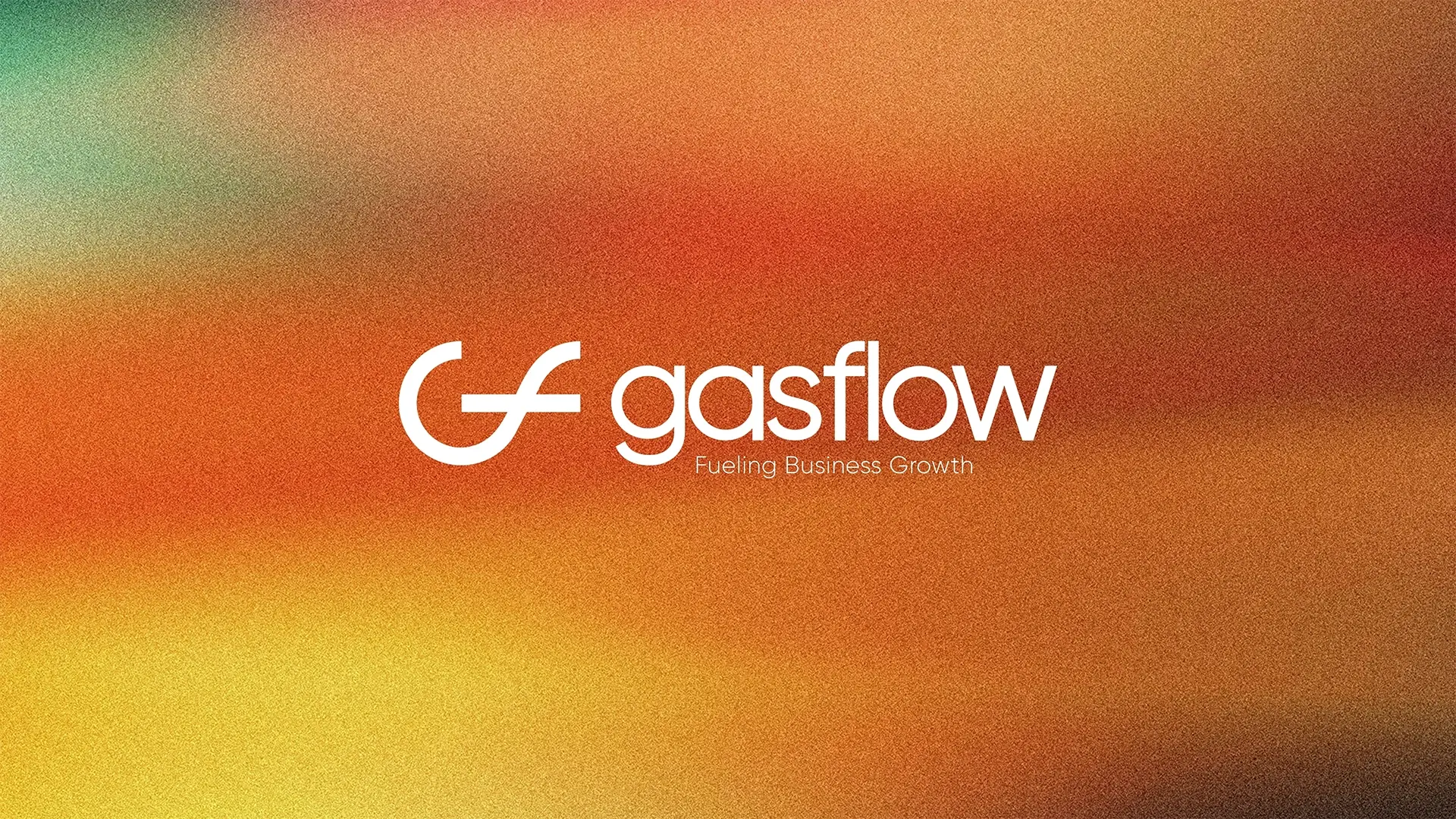
Gasflow is a CRM platform built for businesses in the oil and gas industry. I developed its brand identity around a custom G + F monogram inspired by movement, connection, and the idea of flow.
My role covered the visual identity, including the logo system, color direction, typography, brand applications, and guidelines.
The Project
Gasflow brings stock, buyers, sellers, expenses, salaries, routes, communication, and other daily operations into one CRM platform.
The brand needed to feel credible within the oil and gas industry without looking like a traditional energy company. At the same time, it needed a cleaner digital identity that made sense for a software product.
The Challenge
Oil and gas brands often rely on similar visual cues: dark colors, metallic finishes, industrial imagery, flames, drops, or machinery.
I wanted Gasflow to feel connected to the industry without depending on those familiar symbols.
The identity needed to balance two sides of the business:
- Industry and technology
- Reliability and progress
- Structure and movement
- Professionalism and accessibility
Logo Concept
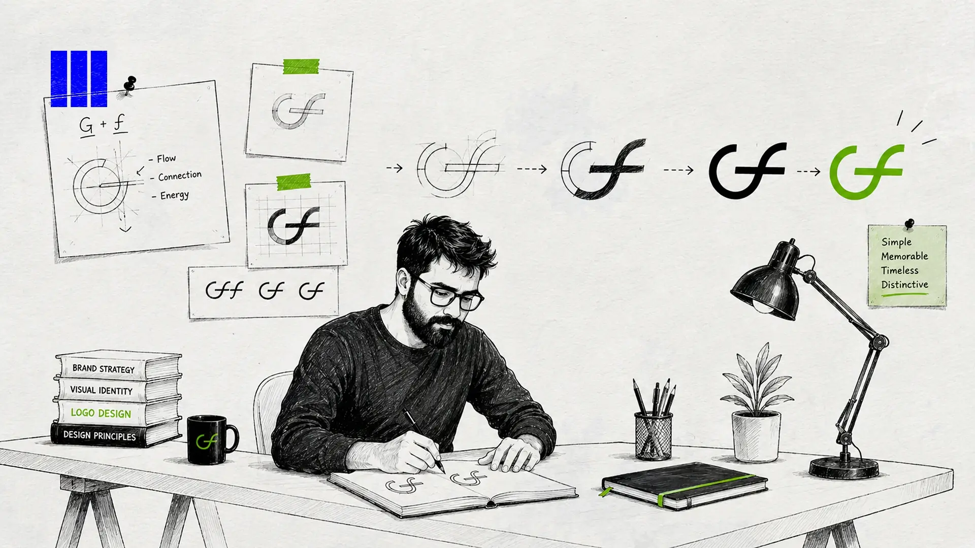
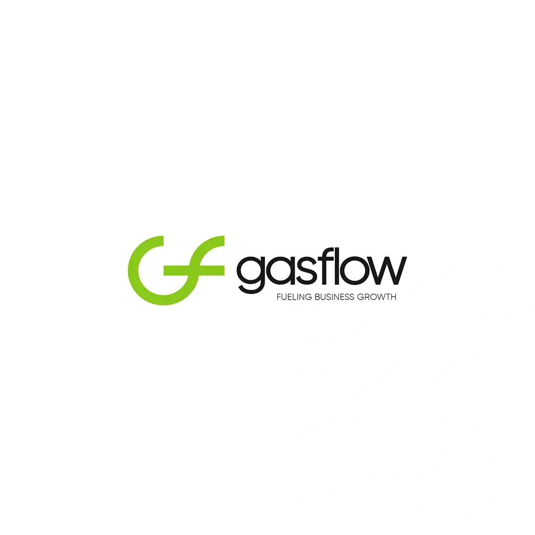
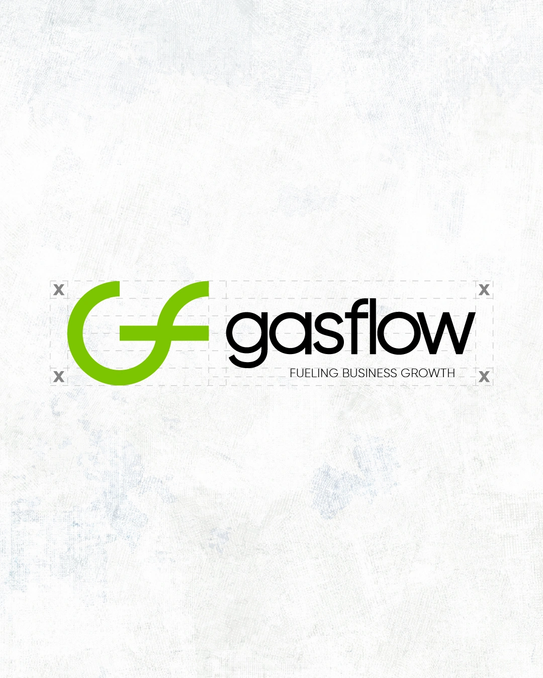
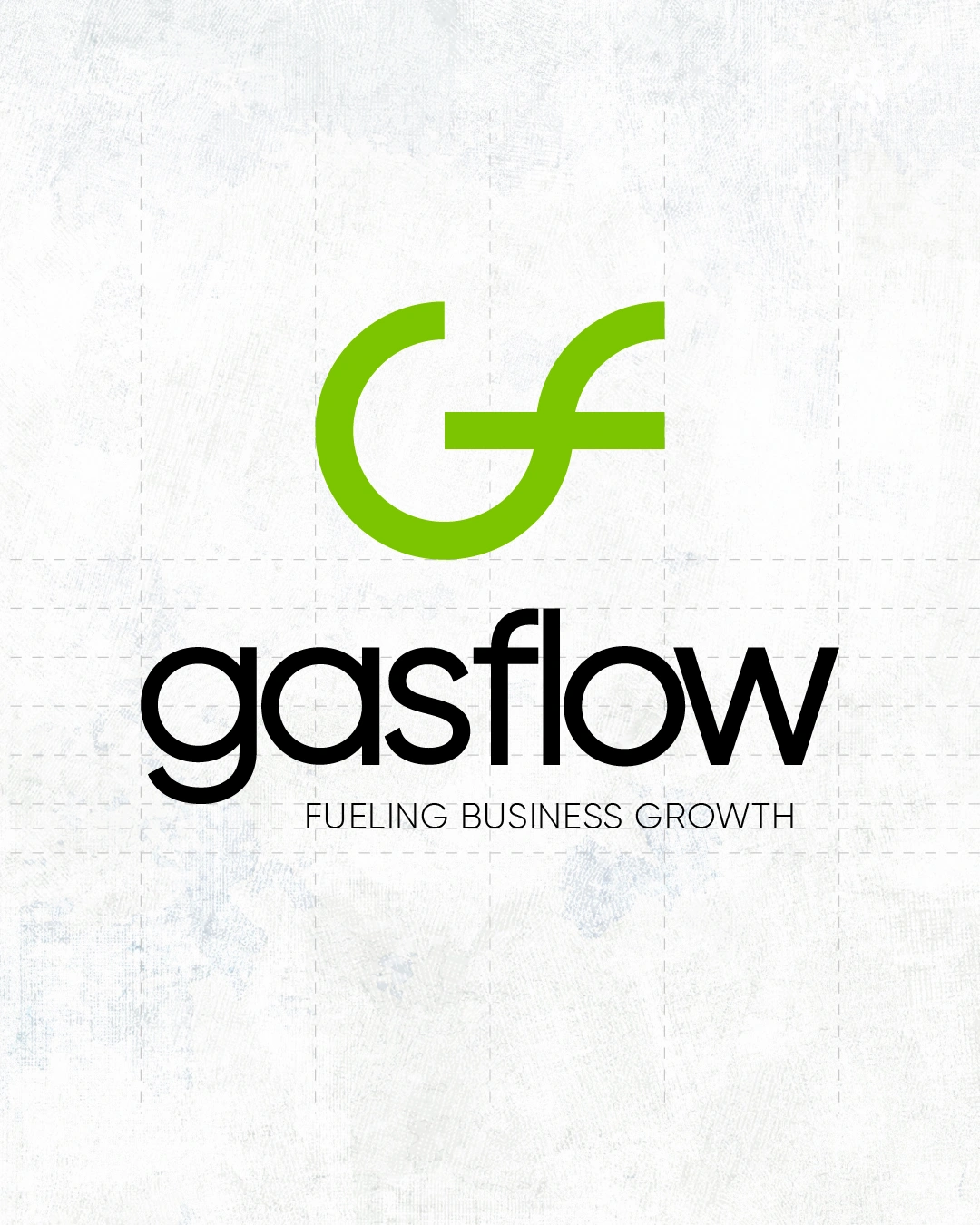
The logo combines the letters G and F into a simple geometric mark.
Its circular form creates continuity, while the opening and horizontal movement give the symbol a sense of direction.
That idea connects naturally with the name Gasflow. It can suggest the physical movement associated with the industry, but also the movement of information, communication, and day-to-day business operations through the platform.
The mark was kept simple so it could work at different sizes, from a small digital icon to larger brand applications.
Color Direction
Green became the main brand color.
Instead of using the darker industrial palette commonly associated with oil and gas, the brighter green gives Gasflow a more recognizable digital presence.
It also works well with the ideas behind the brand: movement, energy, and growth.
Black and white support the primary green and give the identity enough flexibility for both digital and corporate applications.
Typography
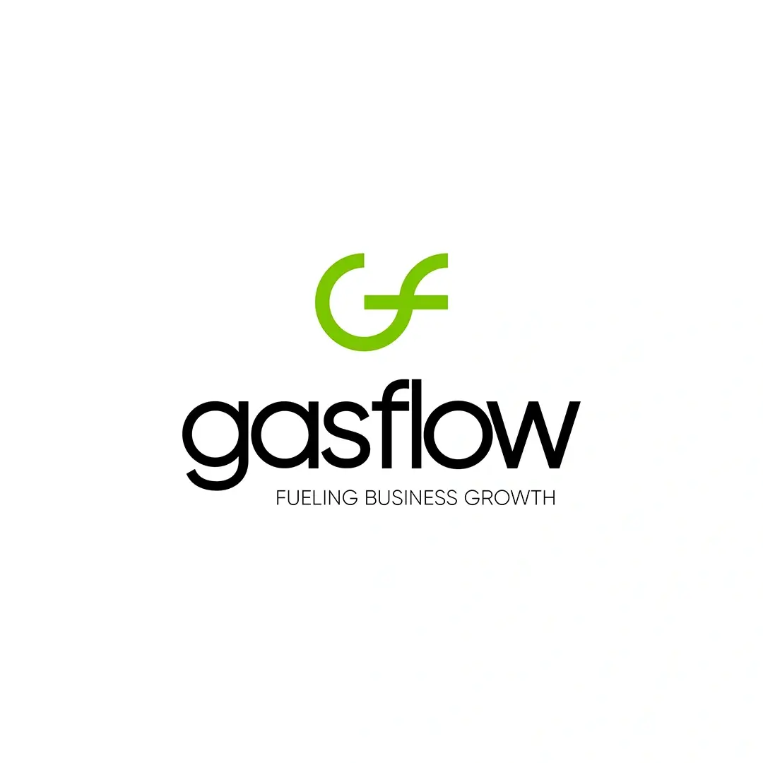
The typography is simple and contemporary.
The goal was not to make it overly technological or industrial. It needed to stay readable, professional, and flexible enough to work across the CRM, marketing material, presentations, social content, and other brand touchpoints.

Tagline
Fueling Business Growth
The tagline connects the industry Gasflow serves with what the product is designed to help businesses do.
“Fueling” has a direct connection to the energy sector, while “Business Growth” shifts the focus toward the value of the platform.
Brand Personality
The identity was built around five characteristics:
Modern > Reliable > Connected > Efficient > Progressive
These helped guide decisions across the logo, color, typography, layouts, and supporting applications.
Brand Applications
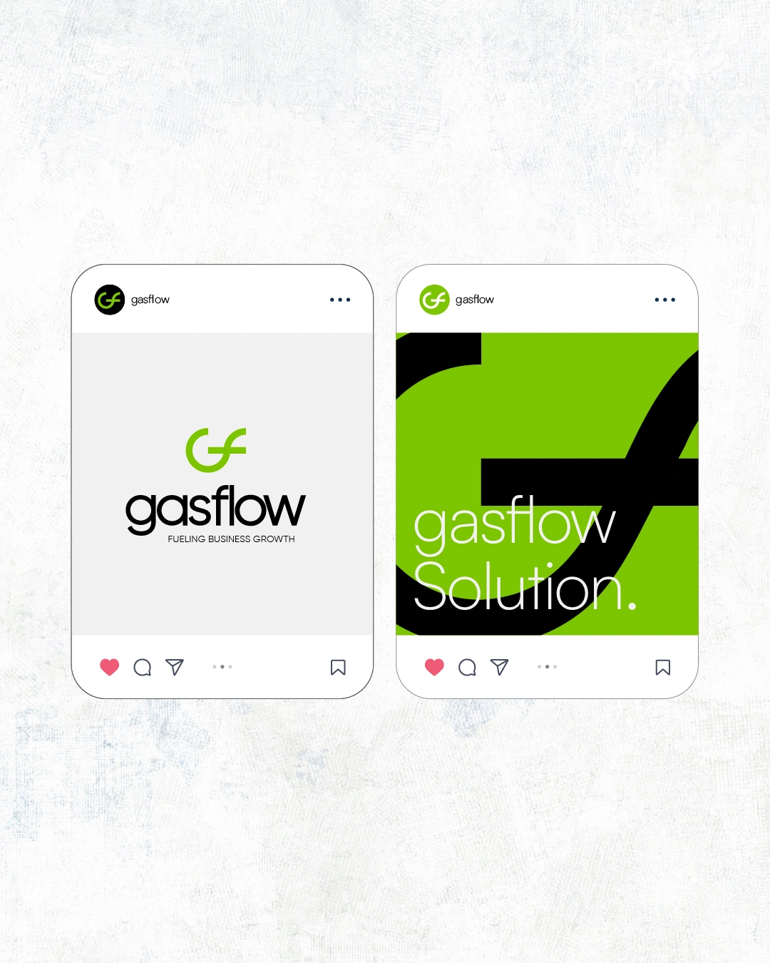
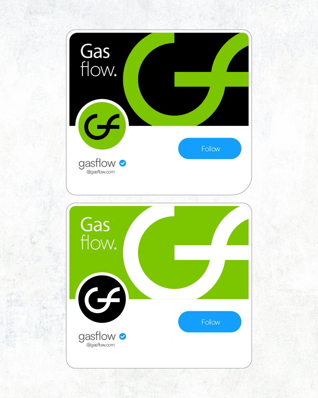
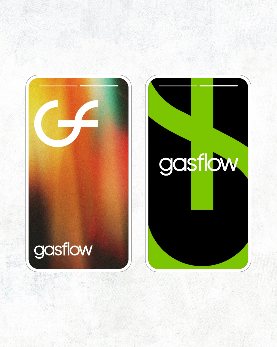
The identity was designed to work beyond the logo itself.
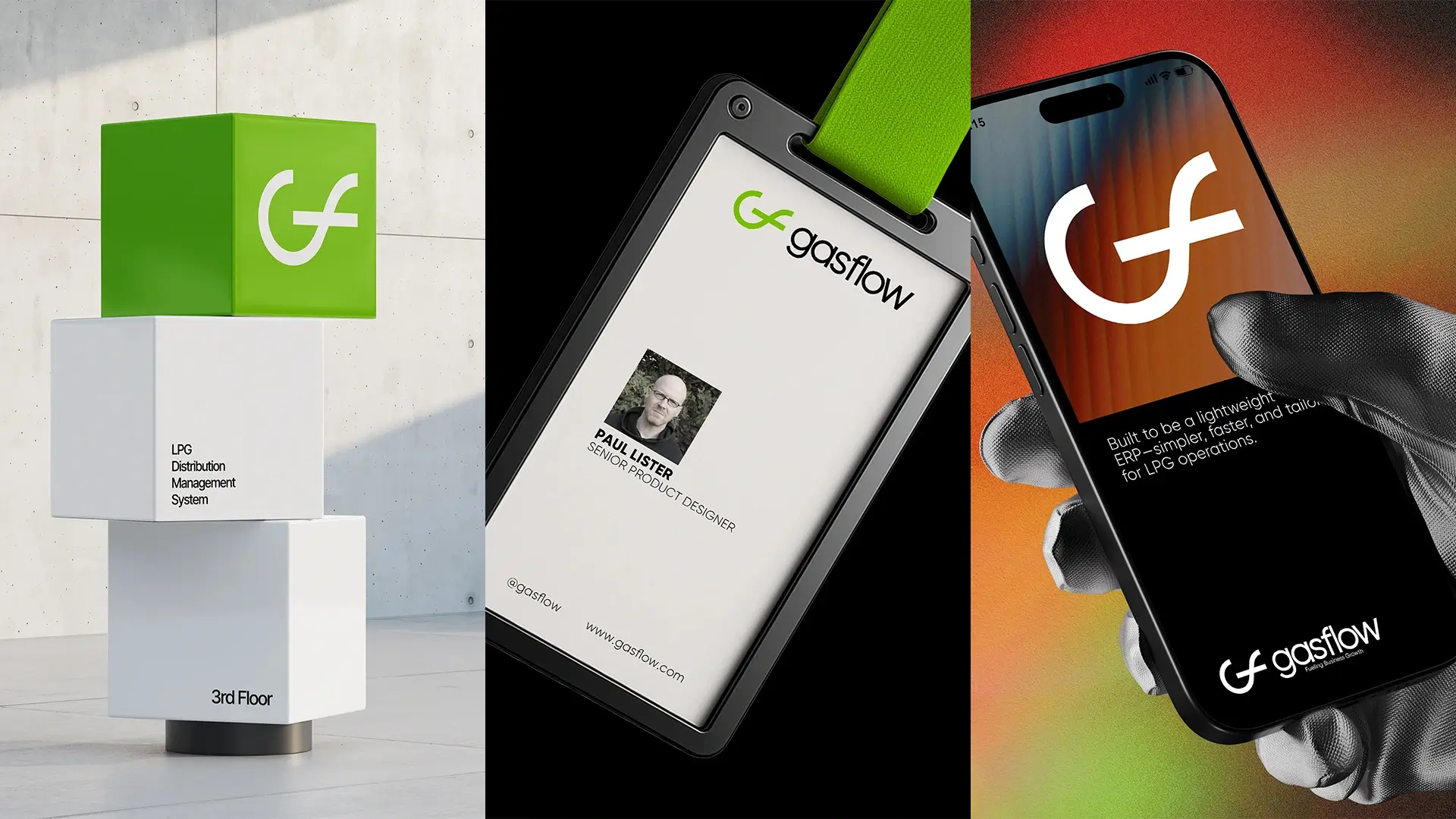
I explored how the system could carry across digital interfaces, social media, profile graphics, signage, employee identification, presentations, and other business touchpoints.
The aim was to make the brand recognizable without requiring the full logo to appear everywhere.

The Result
The final identity gives Gasflow a visual language that feels more like a modern software business while still making sense within the industry it serves.
Rather than using literal oil and gas imagery, the system is built around the idea of flow. That gives the brand a concept it can use consistently across different applications as the product grows.