Role: System Designer
Scope: Pricing system, information hierarchy, in-store communication
Type: Client Project
Location: Valencia, Spain
Intermarche Super is a neighborhood convenience store where much of the day-to-day checkout process is handled manually.
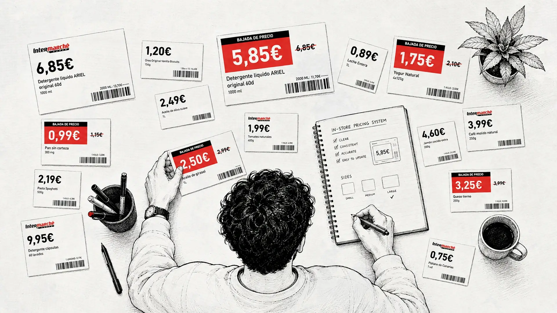
During my observation of the store, I noticed that many products did not have clearly visible prices. Customers often had to ask how much something cost, while regular and discounted prices were not always communicated consistently.
Rather than redesigning the entire store, I focused on one specific problem: pricing.
The Problem
The existing setup created a few recurring issues:
- Prices were not always visible at the shelf
- Regular and discounted products lacked a consistent visual system
- Customers sometimes had to ask staff for basic price information
- Manual pricing made consistency harder to maintain
- The system was not structured with future POS integration in mind
The problem wasn't simply how the price labels looked. It was how pricing information was communicated and managed throughout the store.
The Approach
I wanted the solution to remain realistic for a small business.
Instead of introducing a complicated new system, I focused on three things:
Visibility
Customers should be able to find the price without asking.
Consistency
The same hierarchy and structure should work across different products and shelves.
Scalability
The system should be simple enough to use manually today while being structured for future POS integration.
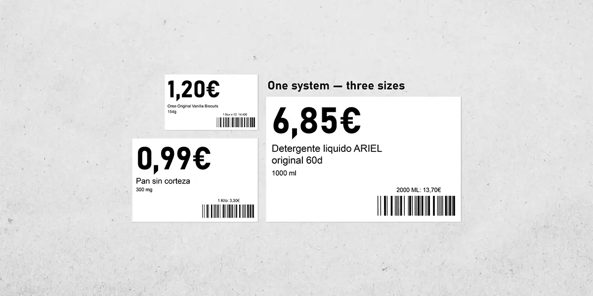
The Pricing System
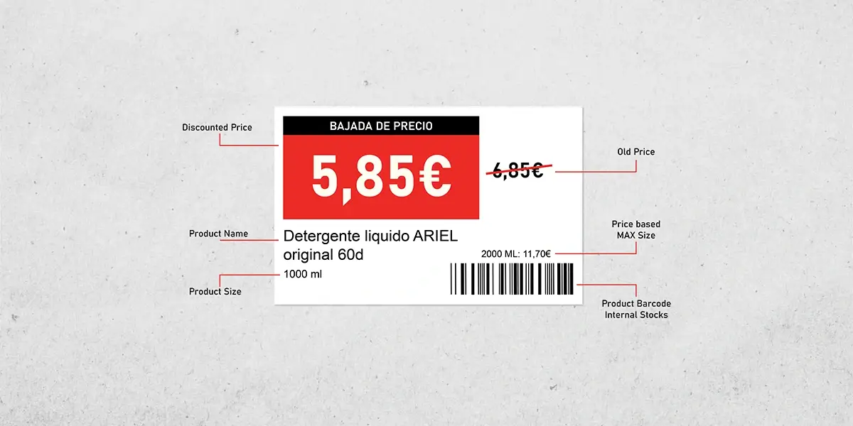
The system separates everyday pricing from promotional pricing while keeping both formats visually connected.
Product information follows the same hierarchy each time:
Product name > Product details > Price > Unit or quantity information
The price receives the strongest visual emphasis because it is the information customers need most quickly.
Normal vs. Discount Pricing
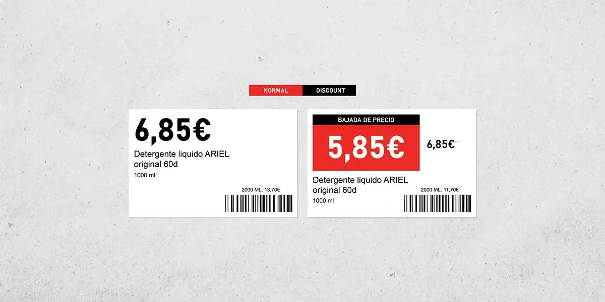
Regular and discounted products need to feel different without creating two completely separate systems.
The standard label keeps the presentation simple and neutral. Discount labels introduce stronger promotional cues while preserving the same basic hierarchy, so customers can still understand the information quickly.
This makes promotions more noticeable without making the shelf feel visually inconsistent.
Information Hierarchy
The design gives each piece of information a clear level of importance.
The price is the first thing the customer should notice. Product information comes next, followed by supporting details such as quantity or unit pricing. This hierarchy helps make each label easier to scan from a normal shopping distance rather than requiring customers to stop and study every tag.
Designing for Real Constraints
A small neighborhood store doesn't need an expensive digital transformation just to improve price communication.
The system was designed around the store's existing conditions: limited space, manual workflows, and the possibility of introducing more automated POS processes later.
That meant keeping the solution simple enough to produce and maintain without creating unnecessary operational work.
Why Pricing Comes First
Clear pricing isn't only a visual detail.
It affects how easily customers can compare products, make decisions, understand promotions, and move through the store without repeatedly asking staff for information.
Creating one consistent pricing structure gives the store a foundation that could later connect with inventory management, POS systems, automated label production, or other operational improvements.
The Outcome
The final concept establishes a consistent framework for displaying normal and discounted prices throughout the store.
It is designed to make pricing easier for customers to understand while giving staff a repeatable structure they could use across different product categories. More importantly, it shows how a relatively small design intervention can address an operational problem without requiring the entire store experience to be redesigned.